Accessibility Labels
Why
Labels are critical for blind users, user with low vision, users with mobility disabilities and users with memory loss. Missing labels will make a form inaccessible for many users.
What
Visual labels are text near a form control that describe what information belongs in a given form field or a group of fields. Each label must be programmatically associated with the form control or group of controls. Labels are not necessarily the <label> element.
How
You will learn how to use <label>, aria-label and <legend>.
The <label>
The <label> tag defines a label for several elements, like <input>, <select> and <textarea>.

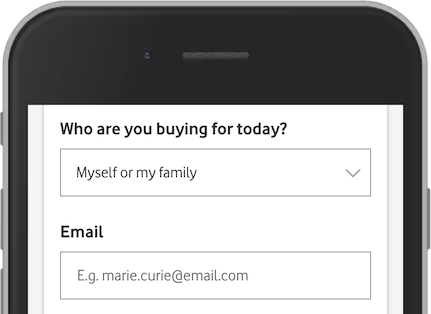
In this example from Vodafone, we have one <select> and one <input type="email">, each with a describing <label>:
<label for="customerType">Who are you buying for today?</label>
<select name="customerType" id="customerType">
Notice the use of the <label> element in the example above.
The <label> element is useful for screen-reader users, because the screen-reader will read out loud the label when the user focus on the input element.
The <label> element also help users who have difficulty clicking on very small regions (such as radio buttons or checkboxes) - because when the user clicks the text within the <label> element, it toggles the radio button or checkbox.
The for attribute of the <label> tag should be equal to the id attribute of the <input> element to bind them together.
Required fields
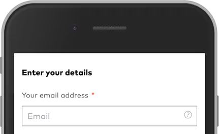
Form labels often contain a "*" or the word "required" to indicate that the field is required. Both of these methods are fine. However, it is recommended to add the required and aria-required="true" to the form control if you use an asterisk (*):

<label for="email">Your email address <span class="mandatory">*</span></label>
<input id="email" name="email" required aria-required="true" placeholder="Email" required="">
The aria-label
Fields without visual labels still needs a label. If you can not use a <label>, one option is to use a aria-label.

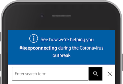
This search field has a placeholder, but no label. A placeholder is not a valid accessible name. You can not rely on it as a substitute. An easy solution here is to add aria-label="Enter search term":
<input placeholder="Enter search term" aria-label="Enter search term">
The <legend>
Groups of form controls, like checkboxes and radio buttons often require a higher level of "label" in addition to the <label>. This high level "label" is made with <fieldset> and <legend>.

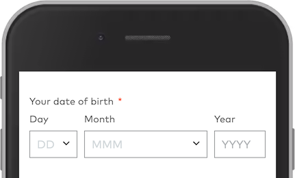
This registration form has three form controls to provide the date of birth. Visually it makes sense that both day, month and year is related to "Your date of birth". This relation is not obvious for a screen reader user. We can not use <label> here. The labels are Day, Month and Year. The solution is to add a <fieldset> and a <legend>:
<fieldset>
<legend>Your date of birth</legend>
<label for="dobDay">Day</label>
<select id="dobDay">…</select>
<label for="dobMonth">Month</label>
<select id="dobMonth">…</select>
<label for="dobYear">Year</label>
<input id="dobYear" type="text" placeholder="YYYY">
</fieldset>
Want to make efficient forms? Learn about autocomplete.


